Thursday 29 March 2012

Music Magazine Evaluation- Q7. Looking back at the preliminary task what do you feel you have learnt in the progression from it to a full product?


Since doing my preliminary task (my college magazine) I have learnt may skills that have helped me complete my media product (music magazine). One of the main things I have learnt which helped me improve the presentation/ quality of my magazine is learning the conventions of a magazine, as by doing this I was able to adopt ideas and make my magazine appear as professional as possible. In comparison with my preliminary task I wasn’t aware of these conventions and this affected the quality of my college magazine.
For example although I included a masthead, cover lines and bar code but it looks like a poster or flyer. Also because of the layout and my lack in knowledge of colour schemes took away the professional look of the magazine.
Also my photoshop skills were something I was not confident with when I started my preliminary task. During the construction of my preliminary task I had no idea about grids, layers, rendering images etc. By improving my photoshop skills during the construction of my media product, it helped me improve the quality of my magazine by teaching me about occupying space using simple tools and simple shapes.
Also my preliminary task only consisted of a front cover and a content page whereas my music magazine included a double page spread as well as the front cover and content page.
I also learnt about how to attract my target audience through my media product properly, whereas in my preliminary task my magazine was not attracting my target audience and the lay out was misleading. This time around I put more time and thought into my magazine including some thoroughly conducted market research on my target audience which also helped with my audience profiling, which also helped produce my finished product. My audience research took me approximately 2 weeks to complete and produce sufficient information.
Also I learnt about not putting my masthead right next to the edge of my magazine and I should leave 1-3 centimetres of space in-between. Learning about the use of space in a music magazine helped whereas before in my preliminary task my magazine had far too much unused space making the magazine look like it lacked content.

I had developed my knowledge of camera angles so that when I took my photos, the camera angles were a small change but they proved very effective. For example on my double page spread I used a low angle shot, and this was because the low angle shot represents strength and power so I used this camera angle to represent the dominance and strength of my subject. Hence a small change but a massive impact on the finished product. I used the same angle on my contents page. I also had my model look into the camera to show no confidence, yet another small change but a large impact on the photo taken, resulting in a more impactful finished product.

My knowledge during the preliminary task about lighting was not good as seen in my college magazine, there is a distracting shadow due to the flash of the camera and the use of indoor lighting. However this time around I made use of the natural lighting after conducting some test run photos on indoor and outdoor lighted pictures and the natural light (sun light) provides better pictures, however a problem is that the sunlight can interfere with the red dot sights locking on to the subject or the subject’s eyes. I overcame this problem by changing the direction I took my pictures sideways from the sun so the light didn’t cause discomfort to my model but didn’t disrupt my photo.

I also learnt with the guidance of a peer about how to cut out the image of Gabriel/ my model from the background. To do this I used the polygonal lasso tool and the pen tool.
Then things became convenient as I had originally decided on a jet black canvas meaning I could tidy the edges by burning them using the burning tool.


I also learnt with the guidance of a peer about how to cut out a part of the image of Gabriel/ my model and put it in front of my masthead, because in most magazines the subject is in front of the masthead.

To put my model in front I had to do this by cutting his image out Firstly I used the polygonal lasso to cut out the top of the head (the area where the masthead is) then I selected it and added refine edges which feather the edges to make the head look more realistic, but a problem with this is that it makes the edges bright and gives them a cloudy outline so I overcame this problem with the burn tool, made possible to use with the black background.
To change the contrast of the image I used adjustments and then contrast and hue and saturation to give the image a little colour.


Wednesday 28 March 2012

Music Magazine Evaluation- Q6. What have you learnt about technologies from the process of constructing this product?


During the process of constructing my media product I learnt a lot about the technology that I used to help me construct my magazine and those skills I had learnt before I used them again, developed and enforced them. I used photoshop CS3 to create and finish my media product, but a problem I faced was that my knowledge of photoshop and my skills in photoshop were very limited.
Because of this I had to spend a lot of time fooling around with the tools and watching some tutorials as well as having my teacher direct me as to how I can accomplish certain tasks and with what tools. In the end my knowledge of photoshop CS3 was just over basic as I constructed my media product and I learned how small effects such as bevel and emboss or even strokes can have the biggest impact on my work. Also I taught myself about rendering and image, in this case adding a camera flare to symbolise something in my magazine and to add a little pizzazz to the image.
I have developed my photo shop skills very much during the process of making this magazine. I learnt about using bevel emboss, drop shadow, glows, render-camera flare, render- editors notes, camera flare,  strokes, burn tool, canvas A3, stamp tool, and various other tools.
To start off with I learnt about the guidelines of making a magazine and used photoshop skills to help me enforce those guidelines. For example to line up my masthead, cover lines, my puff, my bar code, etc. I used the grid tool on photoshop instead of using wild estimates or drawing the lines, and this saved me a lot of time and was thoroughly more accurate.
Then I used these tools and guidance to start laying out my media products without the pictures, so I had a basic understanding of what colour scheme, fonts and layout I was attempting.
My photos were taken in different locations and only one of the overall 3 pictures had a natural background, the others I used my photoshop skills to cut my subject out of the background and then insert him onto a black background. Also in my front page I used the same technique to put my model in front of my masthead.
I used Da font.com (http://www.dafont.com/) to download fonts that I could use to make my magazine stand out further and interlink it with my photoshop work. Also in order to respect copyright laws of the website and of the authors I only downloaded the “free” or “free for use” fonts.

I also looked into advanced technologies to show the examiner that I am up to date with my knowledge or the virtual market, and how technology plays a key role in everyday life (especially young and teenage life) and exploited that by generating my own black berry messenger bar code using the following site: 
·         http://qrcode.kaywa.com/

I used a Canon E0S 400D Digital camera to take all but 2 of my images, the other two were taken with a  Nikon Coolpix S3100, and the camera was high in quality giving the photos I took a polished look and in very little need of photoshop editing depending on how well the pictures were taken.
Also I learnt that flash isn’t always the best solution for lighting as is indoor lighting as it tends to create a distracting shadow behind the subject so I used natural sunlight.  
Although I used this same camera for my preliminary task (college magazine) which is fairly similar I found that with the main task I learnt more about the cameras functions and how to use it to create my desired affect. For example to capture the image the red dots that I saw when I looked through had to be lined up with my models eyes to capture a good image, and that in sunlight the image wont capture because when the red dot sight isn’t lined up with the subjects eyes the picture doesn’t get taken or the picture itself doesn’t come well. Also I learnt about the different settings and about how to use different camera angles to really blow up the representation of my model.


The main problems I faced whilst using the camera was the different camera angles and obtaining camera shots at the right angle and keeping it straight whilst using it so that my pictures did not come out tilted creating more editing work for me and wasting time. I would say this is due to my lack of experience and skill in taking professional photos.
I resolved this problem by taking multiple shots (10-20 of one pose) and by tuning the setting of the camera I adjusted the camera to snap 4 photos in one click (increasing shutter speed) so that I saved as much time as I could, and by taking multiple shots I was bound to eventually end up with the right kind of picture, it was just a case of narrowing down and selecting.
I also learnt that photoshop created JPEG files which was needed to upload my finished products on to my blog as blogger does not allow you to upload images unless the images are JPEG files. After creating the JPEG file I would upload my work onto my blog.

Music Magazine Evaluation- Q5. How did you attract/address your audience?


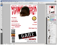
I worked mainly on my front page to catch my target audiences eyes because it would be the first thing they see out of the whole magazine, and that will decide whether they pick it up or not, so I used a lot of my methods of attraction in my front cover.

 On my front cover I attracted my target audience (black teenagers aged 11-19) by using a popular trend amongst young black teenagers which is a street name/ rap name or in slang a “tag”. By taking the tag/ street name “Gabz” and surrounding it in a stamp like box to make it stand out. Also to make it very appealing to teenagers I made sure that the font was defaced or deteriorated (destroyed_aero).
I also asked my model to add facial expressions to his pose and squint his eyes/ screw up his face slightly or as it’s known by teenagers in slang “screwing”. Screwing is usually done to show some kind of attitude problem, so I did this so that teenagers can see this and they can relate to it and will pick up that he’s screwing very easily so they become intrigued as to why he is screwing meaning that they will pick up the magazine to find out.

The BBM bar code was very useful in attracting as well because it involves technology which is a popular thing amongst teenagers of the age group (11-19) in particular social networking and BBM is a kind of social network which will appeal to my target audience. Sticking to the topic of technology I included a “free I-Tunes download” on my bar code which will appeal to the target audience because it means they can use their laptops and phones to download whatever they thought was being advertised for free download, because to download technology (usually modern) is needed and as I previously stated teenagers are very attached to technology and it plays a huge part in the lives of most.
In my cover lines I used well known popular rap names to entice my audience and at the same time keep to the genre of the magazine. Also the names bar at the top which has names of featured artists and people in the magazine had a lot of popular UK rap artists which can interest the target audience into looking to see if they can support them. Also I included an NBA basketball stars name “Dwyane Wade” and then put the cover line “King of the court, NBA’s greatest players” to really watch the viewers eye on such a big star featuring in a rap magazine.
On my contents page I used the pose of calm, mellow and as teenagers like to put it “zoned out”. That means to be in their own little zone or world, and I did that in this picture by making my model illustrate he’s alone with his thoughts and I got the idea from a tumbler picture that quotes “when you’re lonely music is your only friend “.
I asked for him to listen to music to show what teenagers do when they want to get away from problems in life, or when they need something to motivate them and help them through problems. I wanted to show this without including the actual quote itself in the magazine product that for teenagers sometimes music is their only friend, and a lot of teenagers can relate to that so I decide to definitely use that method of attraction.

Also when I took my double page spread I used a similar method, asking him to put on a serious look so that in a way he came across as angry or annoyed, and a lot of teenagers are known for being rebellious and angry at society so the facial expression worked well in contrast to what I wanted to achieve.

Also to appeal to my young target audience I gave the magazine masthead an original name and made it appealing to my target audience by calling it “Young World” which makes my product a niche product because it pretty much warns off the older age groups (people above 19 or 20) as they would feel uncomfortable reading a magazine at their age entitled “Young World”.

However by doing this it appeals further to my target audience as they won’t really see people above 26 reading it so they would see it as cool, young, trendy and fresh.

 Also their parents would not be reading the magazine because they may not understand it and it would be viewed as inappropriate for them to read it so the teenagers (my main target audience) would feel safe reading my magazine knowing their parents would not be able to keep tabs on what they are reading. 
Also I attracted my audience through colour scheme which consisted of 2 dark colours which were very strong on the page and 2 light/ bright colours which were very eye catching, 1 of the two very vibrant on the page, catching peoples eye.

The red, black, yellow and white colour scheme was very contrasting with the red and black looking very strong on the page which would mainly draw the eyes of males because they are very boyish colours and a lot of young males in London (black in particular) like to dress all black or as they say “blacked out”.
The white and yellow were subtle touches to appeal to the female side of my audience along with the colours of the costume I made my model wear so that the females didn’t see the magazine as to masculine and would make them shy away, I used very smart-casual, light coloured clothes to allow my model to appeal to the female audience, still look masculine but contrast with my magazine.
Also I made my model wear a brightly coloured costume to contrast against the dark background, and made sure that my model had one of his clothes (his jeans) dark and in the end we went with black jeans as well as the brightly coloured striped grey jumper.
Also I made sure the photo I took of my model showed a soft side, but the facial expressions gave him a masculine look appealing to both genders. I made sure I appealed to both genders consistently, for example by making the main cover line rugged and very boyish with a black background with white deteriorated font, but the costume was very subtle, but not feminine, however because he is well presented it would appeal to my female audience as they may find he has a sex appeal or swagger that strikes their interest.

This is known as female gaze theory, because a male is on the front cover that females might find particularly attractive the females may choose to pick up the magazine due to that one factor. Two of the images taken were in the same costume but different poses.
Throughout my magazine I used mostly Standard English and some slang that can be understood by mainly the young and the slightly by the older because if some people didn’t understand slang then to use it throughout the content of my whole magazine might alienate the reader, and I didn’t want to further narrow down my audience by aiming it at fully ghetto slang speaking teens.
However I used swearing in my double page spread to appeal to my young audience as swearing is part of a lot of young teen’s vocabulary and also it is a type of rebellion so they would relate to it.

Monday 26 March 2012

Music Magazine Evaluation- Q4.Who would be the audience for your media product?

Judging from the results of my audience research, I’m targeting an 11-19 year old that are in to rap music or are aspiring rappers as my target audience. Also the age group was suitable for the type of artists that featured in my magazine, the content of the magazine and the type of magazine. Also rap can be performed by middle aged males and females, but they are usually listened to by the younger generation, insinuating that rap culture belongs to the younger generation.   


The ethnic group would be mainly aimed at black people as the black culture is particularly into rap and hip hop music, so to appeal to that audience a lot of the rappers, if not the majority are black artists and featured or are artists who would appeal to black rappers. However it doesn’t mean to say the magazine isn’t for everyone, just that the magazine is more appealing to the black ethnic group, and it is for both genders.

Sunday 25 March 2012

Music Magazine Evaluation- Q3. What kind of media insinuation might distribute your media product and why?


I feel XXL (pronounced double-ex el) is a Hip-Hop magazine, would be most likely to distribute my magazine for a number of reasons. One is the type of magazine I produced follows its conventions so it would appeal to the same target audience. My music magazine also focuses on the rap genre of music, and that is what XXL mainly specialises in as most of their front covers include rap artists such as Eminem, 50 Cent, Dr. Dre, etc. 


Also the distribution of my magazine would mean that XXL would earn more money because the product I have produced appeals to the young target audience and they are the biggest customers for music magazines.

 In addition to that by distributing my magazine there is hardly any competition as music magazines are aimed at a wider target audience and the fact I made my magazine a niche product it will appeal to a certain size of the community and by doing that it will be more likely to succeed as they are the main customers of music magazines in general. If this happens then there would be great benefits for my company (Young World).

Financially the company would hopefully be stable enough from the amount of customers to do partnership deals with XXL working in their favour as my company can obtain artists and stars to feature in the magazine at a lower cost and even participate in advertisements and possibly attract enough support to gain sponsors. By my company benefiting it will benefit XXL as they obtain a slice of the profits my company make as they are the distributors.

I would also like to point out that my magazine would be sold or purchased in stores such as HMV one of the largest UK media/ music stores, particularly for big music fans. It would be the most logical thing to do having my product sold in that store as it specialises in music and the selling of music products. Also WHSmith is another store that sells music and media products so I would most likely look to have my product distributed there as well.


Having these stores distribute my magazine in these stores would allow easier access to purchasing my media product as these stores are well known and have a good reputation keeping their customers loyal (brand loyalty), and the stores are world wide so I could have the magazine produced only for the UK but it could potentially spread to a larger target audience due to the popularity of the stores.

Saturday 24 March 2012

Music Magazine Evaluation- Q2. How does your media product represent particular social groups?

My media product represents young black British males (teenagers aged from 11-19), but also is inspired by young black American males of the same age group.
However it also has a representation for young black American males as the genre of rap music did originate mainly from America and a popular sport for young black males in that country is basketball. I represented this by taking my contents page picture in the sports hall using the basketball court, including the basketball hoop as my background and ball as a prop. 

My media product applies a theory called male gaze theory, which means that the most attractive male has most likely been selected and used in my media product to mainly attract a lot of female viewers and some male viewers to.  

The subculture it would be mainly aimed at is hip kids, ghetto kids, street kids and the upcoming rappers.

The pose was of the subject with his index finger on his lips insinuating a “sssshhhh” noise to back up the main cover line “Gabz biggest rap secrets revealed”. This is because when someone wants someone else to keep a secret they don’t want it being  repeated or spoken about  so they try to keep it as quiet as possible, and the “sssshhhh” noise is a very common form of  communication to tell someone to keep silent so I decided I wanted my model to strike that pose. It enforces the word “secrets” and to have that secret “revealed” will catch the viewer’s eye.


This pose was also very convenient as it is common amongst young people, particularly teenagers from the ages of 11-19 to gossip a lot so the “sssshhhh” pose can really relate to teenage viewers and in particular female viewers as they tend to gossip more than most males. But my main inspiration was from a brand of clothing known as trapstar clothing that have the slogan “shhh it’s a secret”.

For the contents the representation on American culture is used a lot, but that is mainly because America is where the genre of rap music did originate mainly from, and in America a popular sport for young black males in that country is basketball so I photographed my model on the basketball court using a low angle shot to show dominance and also to get a good view of the basketball hoop and show him sitting on a basketball. The pose he struck was with his headphones on listening to music.
Also to help with the representation the costume was a baseball jacket, which is another popular sport in America (baseball). The photo had a very American feel about it, but at the same time it didn’t stray from the rap music feeling of the photo as all those factors tied in.  This was the aim as a lot of black English teenager’s (in particular London) culture is similar to those of an American teenager, so in effect they can relate to the magazine either way.


Thursday 22 March 2012

Music Magazine Evaluation- Q1. In what ways does your media product use, develop or challenge forms and conventions of real media products?


Above is the front page of my music magazine and the  magazine I used to follow conventions with anotations.

Before I began constructing my music magazine I carried out questionnaires on how people think my magazine should be presented but I had already done some research and had a very good idea on how I wanted to conduct my magazine.
Also I designed drafts of my music magazine.  This gave me direction, instead of wasting time using a trial and error method. I followed the ideas of this magazine as much as I could by adding and taking some things out so that I could be able to have a finished product that looked as presentable as possible.
This in effect made the task easier and allowed me more time to concentrate on the models, colour scheme, settings, costume, poses and other various important factors of my magazine. By doing this I also was able to have a sense of direction in terms of what I wanted to achieve (my target) and in terms of how long it should take to achieve just the layout and what resources I would most likely need in the process of creating my magazine front cover and my magazine double page spread.
The font colours, the model that I wanted on my front cover, contents and double page spread (the same model to keep a consistency). Then once I had established what exactly I was going to do I began my layout as I hadn’t taken my pictures yet, and I thought that would be an easier task.
When doing the layout of my masthead, names bar and cover line, etc, I made sure that my media magazine followed the conventions portrayed in a VIBE magazine featuring trey songs on the front cover. The forms and conventions I used from this magazine was the colour scheme of the font, font size, and of the masthead. I also adopted the bar code joined with the website idea and noticed the date below and used that idea. My media product follows the conventions of trey songs front cover shown above, using the red, black and white colour scheme. This is shown in the main cover line, the cover lines, the black background and the masthead.

The red masthead was a convention I decided from the start I would definitely have to follow and use. However the names bar was done in white font and I decided to develop this convention by turning the font red as well. I was very keen on the red, black and white colour because rap is a predominantly black culture/ person music genre which is what the black colour scheme represents. The white represents how white people have over the years been more involved in rap and in listening to rap music.

Finally the red represents blood, which is a symbol or expression of suffering of black people and blood spilled by them and how the black people particularly in America were tired of oppression which led to them using rap music to express themselves. An example to this is N.W.A (Niggaz Wit Attitudes). 

Also another convention I followed was the small date under the bar code, but I decide to slightly develop/ challenge this form of convention by putting it in the top right of my media product (music magazine) just under the masthead and because it’s white it would stand out on the black background very easily.

I also duplicated the bar code and the website idea with the massive dot, but I slightly developed this form of convention by putting a BBM (Black Berry Messenger) bar code on top which if scanned will direct the viewer to my blog. I generated this bar code using the following link: http://qrcode.kaywa.com/

Another convention I decided to develop was the stamp looking cover line and use it to make my main cover line stand out in my media product by over lapping part of the cover line onto the stamp and making the font on the stamp look destroyed or damaged which is a signification of teenage rebellion which shows the youthfulness behind the magazine. However I still stuck to the black white and red colour scheme. To make sure that the cover lines didn’t seem too dull I gave them a black stroke and made it large enough to catch the attention of a viewer but again sticking to the colour scheme by making the stroke black is sticking to the colour scheme showing consistency.

I added a camera flare to give the picture (top right corner) that slight edge which challenged conventions of magazines and the magazine conventions that I was following, but this it represents a rising and a shining star (a term used to refer to superstars or talented youths).

For my contents page I followed conventions of soulja boy and 50 cent’s XXL magazine for my contents. The layout is the overall convention that I tried to follow, however I used conventions from other magazines, one with the heading “the B-side” slightly similar to the main conventions I followed but still different conventions. My media products contents page was really inspired by XXL magazine and followed a lot of its conventions. The VIBE magazine with Eminem in it inspired me to follow the convention to fill the whole page with the picture.

When I did this I decided to use the stamp tool to fill up a white space at the top of the page and in effect challenge the convention by using the same image 3 times. I wanted to leave no blanks or white spots so that was my alternative but without using different pictures, using the same image just cloning it.

Originally I had planned to use an all white background for my double page spread as it would look really good/ contrast with the costume that I had picked out (which consisted of dark colours) and draw the viewers attention to the picture as well as the text.

However due to a change in thought to the costume and the background colour I had to abandon the idea but still used some of the conventions. For example I used the heading, and the drop capital idea along with the white page with black text as the contrast made the page look like it contained a lot of information and it also went really well with the font colours I had picked out, making it easy to stick to a specific colour scheme.

What was very convenient is that the new magazine which I was using as a guide had similar or the exact same conventions (i.e the drop capital, white page, and the writing under the heading).

For the double page spread I was following the conventions of Wiz Khalifa’s double page spread in Vibe magazine. I was very keen to use the black and white colour scheme because it represents coming between white and black in the rap music industry, and the gold is to represent success and riches.  The black and white colour scheme also contrasted with the font colours used.

Also the gold and black font on the white background really stands out, and on the black background the picture was made the main focus. I used this form of convention and threw a quote onto the picture, which developed this convention. I added strokes to the photographer and writer name to make them stand out, this challenges conventions because it’s not used in music magazines but it is eye catching and by making the stroke black it stuck to the colour scheme.

I did the same thing to the quote to make it stand out by giving it a gold stroke and to make it look polished I added a bevel but  I made sure that it would suit with the background by keeping it black.
I made sure that attention wasn’t drawn away from the picture by adding a camera flare to the top right corner of the picture. I had used a camera flare throughout two of the three pictures to keep a level of consistency going, but at the same time challenge conventions because it isn’t usually something seen in magazines but it is there to also represent a rising and a shining star (a term used to refer to superstars or talented youths). 

Plus I followed the convention of having a black male on my front cover as in most rap magazines they do, there are hardly any female rappers on the front cover on music magazines, they’re predominantly black male rappers, especially in the magazine company that I am using as a guide.