
Since doing my preliminary task (my college magazine) I have learnt may skills that have helped me complete my media product (music magazine). One of the main things I have learnt which helped me improve the presentation/ quality of my magazine is learning the conventions of a magazine, as by doing this I was able to adopt ideas and make my magazine appear as professional as possible. In comparison with my preliminary task I wasn’t aware of these conventions and this affected the quality of my college magazine.
For example although I included a masthead, cover lines and bar code but it looks like a poster or flyer. Also because of the layout and my lack in knowledge of colour schemes took away the professional look of the magazine.
Also my photoshop skills were something I was not confident with when I started my preliminary task. During the construction of my preliminary task I had no idea about grids, layers, rendering images etc. By improving my photoshop skills during the construction of my media product, it helped me improve the quality of my magazine by teaching me about occupying space using simple tools and simple shapes.
Also my preliminary task only consisted of a front cover and a content page whereas my music magazine included a double page spread as well as the front cover and content page.
I also learnt about how to attract my target audience through my media product properly, whereas in my preliminary task my magazine was not attracting my target audience and the lay out was misleading. This time around I put more time and thought into my magazine including some thoroughly conducted market research on my target audience which also helped with my audience profiling, which also helped produce my finished product. My audience research took me approximately 2 weeks to complete and produce sufficient information.
Also I learnt about not putting my masthead right next to the edge of my magazine and I should leave 1-3 centimetres of space in-between. Learning about the use of space in a music magazine helped whereas before in my preliminary task my magazine had far too much unused space making the magazine look like it lacked content.


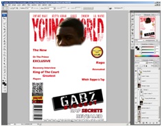
I also learnt with the guidance of a peer about how to cut out the image of Gabriel/ my model from the background. To do this I used the polygonal lasso tool and the pen tool.
Then things became convenient as I had originally decided on a jet black canvas meaning I could tidy the edges by burning them using the burning tool.

To put my model in front I had to do this by cutting his image out Firstly I used the polygonal lasso to cut out the top of the head (the area where the masthead is) then I selected it and added refine edges which feather the edges to make the head look more realistic, but a problem with this is that it makes the edges bright and gives them a cloudy outline so I overcame this problem with the burn tool, made possible to use with the black background.
To change the contrast of the image I used adjustments and then contrast and hue and saturation to give the image a little colour.
No comments:
Post a Comment